Sparkdriverapp.com design refresh
As part of the migration to a CMS tool, I led the end-to-end redesign of the Spark Driver website, aligning the experience with the Spark Driver app to enhance usability and increase driver sign-ups.
Collaborators
Content, graphic design, product, creative production, and engineering
Timeline
Q2 2024
Role
Solo designer, responsible for research and end-to-end design

Background
Sparkdriverapp.com, formerly drive4spark.walmart.com, is the primary recruitment tool for the Spark Driver™ app. While the app has evolved, the website remained outdated and inconsistent, creating friction for prospective drivers.
Leveraging a CMS migration, the team initiated a design refresh of the site to modernize the interface, align with the brand, and optimize the mobile experience.

Research
Competitor analysis
I analyzed key competitors to help me structure information and optimize the mobile long-scroll experience. Major takeaways include:
-
Use short, action-oriented headlines and minimal copy
-
Keep the “Sign-up” button visible throughout the scroll
-
Use icons, bullet points, and white space to support mobile browsing experiences
Heuristic evaluation / site audit
I also conducted a heuristic evaluation of the existing site to identify usability issues. This helped me uncover friction points and prioritize areas for improvement.

Ideate
Sitemap

Ideation began with aligning on the site structure and content strategy. I worked with stakeholders closely to define the sitemap, clarify key interactions, and determine what content belonged on each page.
Wireframe
Once the structure was agreed upon, I created low-fidelity wireframes of the mobile experience to align everyone on layout, key sections, and primary calls-to-action before moving into higher-fidelity design.

Final design
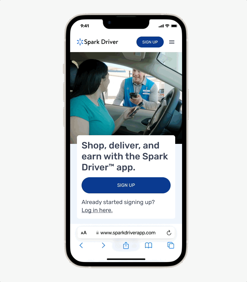
Home page
The site opens with an autoplay video to set expectations, followed immediately by a primary 'Sign Up' CTA. The layout then addresses top driver questions such as earnings, trip types, and eligibility, with a "Learn more" CTA for more details.
To improve mobile usability, the redesign features a persistent 'Sign Up' button and uses color-blocked sections to break the long scroll into scannable, digestible chunks.
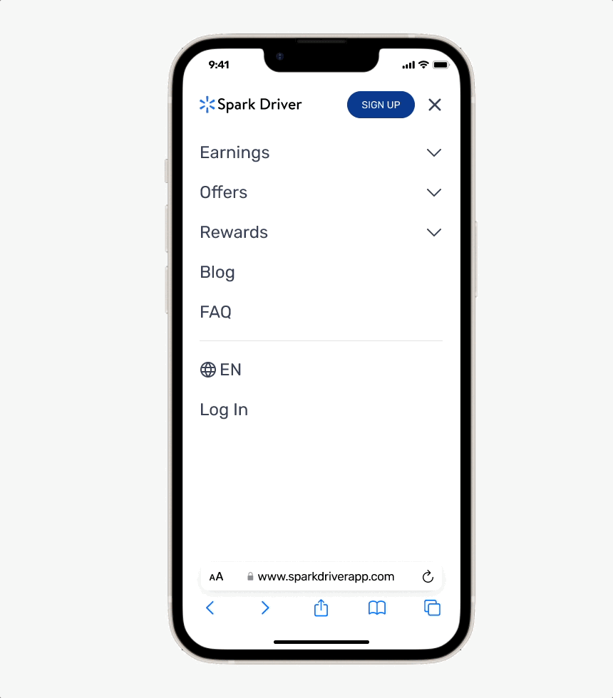
Navigation
The new side menu streamlines access to key areas like earnings, offers, rewards, and FAQs, along with language and login settings.
The menu expands and anchors to specific sections of the page, allowing users to preview the page content at a glance and instantly navigate to the content they need.
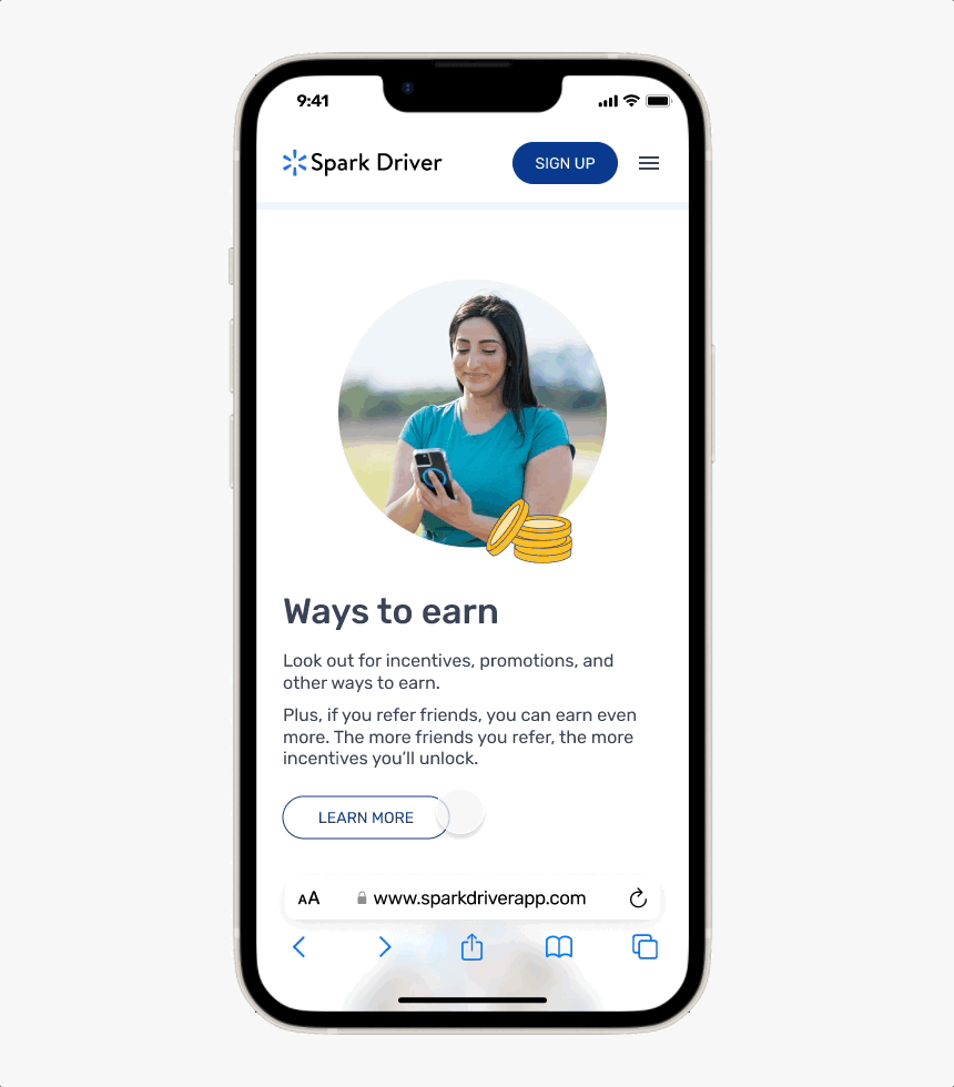
Subpages
Users can navigate to subpages through the side menu or the homepage’s “Learn More” CTA. Each subpage focuses on a single topic—such as earnings, offers, or rewards, and presents detailed information in a structured, long-scroll layout.
Content is broken into clearly labeled sections using short titles and color-blocked backgrounds, making the experience easy to scan, intuitive to navigate, and consistent with the homepage design.
Blog
The blog highlights driver stories and platform updates, with a featured article at the top of the page followed by a list of past posts.
The redesign emphasizes clarity and consistency by adding tags and release dates and standardizing the blog card layout, making articles easier to scan, compare, and discover.
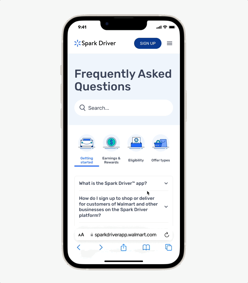
FAQs
The FAQ redesign improves discoverability and readability by introducing a search bar and strengthening the visual hierarchy between questions and answers. Related questions are clearly grouped by topic, making it easier for users to scan and locate the information they need.

Responsive design

Although over 90% of the traffic is via mobile, the website was designed with responsiveness in mind.
Here I am showing a few screens as examples.
Reflections
Impact & growth
The redesign improves usability, navigation, and scannability while supporting a CMS migration through modular layouts and reusable components, enabling both a better user experience and easier content management.
Things I would do differently
Given the quick release timeline, this redesign prioritized speed and foundational improvements. In future projects, I would align earlier on CMS constraints and collaborate with the visual design team from the start to incorporate feedback throughout the process.

